accessiBe’s accessWidget – Digital Inclusivity made easy
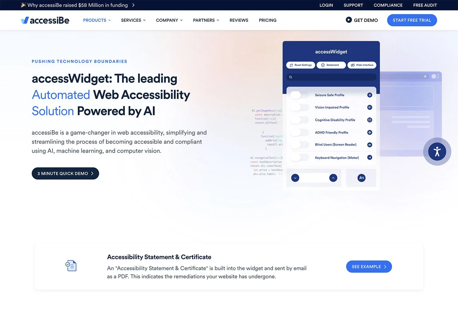
accessiBe’s accessWidget landing page states: accessWidget: The leading Automated Web Accessibility Solution Powered by AI. PUSHING TECHNOLOGY BOUNDARIES. accessiBe is a game-changer in web accessibility, simplifying and streamlining the process of becoming accessible and compliant using AI, machine learning, and computer vision.
High claims indeed, and they are pretty much on the button, I’d say.
Website accessibility can often be overlooked. And I’m not just talking about accessibility law from a disability perspective, as websites have traditionally been designed by designers who consider visual style, usability, and SEO. In legal terms, accessiBe's Squarespace accessibility extension helps you comply with the Americans with Disabilities Act (ADA) and, in the UK, the Equality Act 2010.
What isn’t typical is having a standard practice of designing for disability usability considerations. So, subconscious bias can and often lead to elements of a site being harder to process for some users with a disability, including neurodivergent differences.
As an autistic creative with ADHD, I know first-hand that some content can cause issues. I also have an ever-growing network of creative freelancers, clients and friends who are neurodivergent.
Anyway, I digress; it's time to go over the basics of installing accessWidget.
Installation
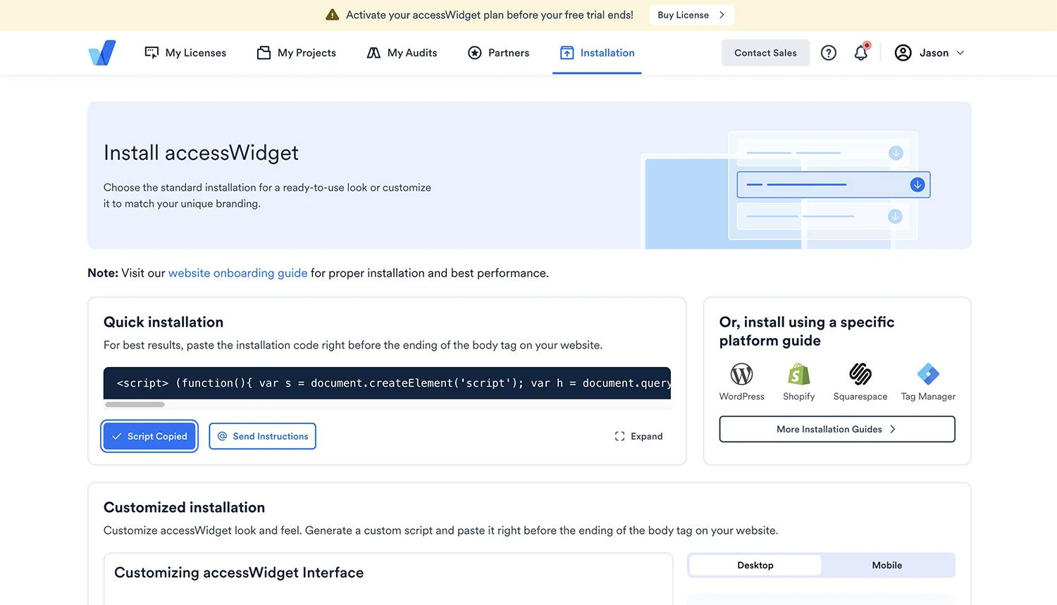
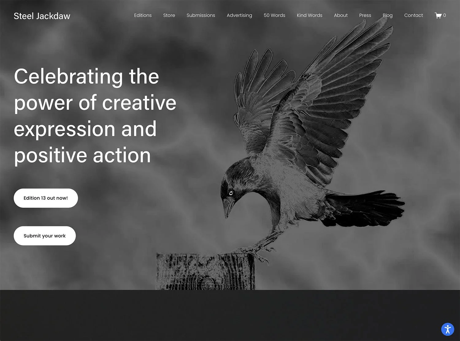
If you’re averse to website code and third-party tools in general, you’ll be pleasantly surprised by accessiBe. From the installation page and being a Squarespace Expert, I selected the installation guide for Squarespace, which provided clear, easy-to-follow instructions. Once you copy the code provided with one click, you paste it into the footer code section of your Squarespace website and save it. It’s that simple! For the purposes of this review, I installed the widget on my Steel Jackdaw magazine website.
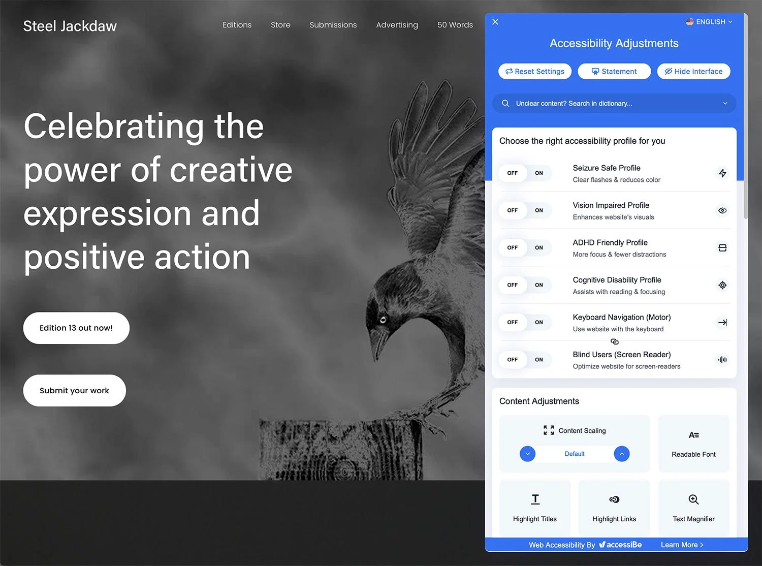
The installed widget is displayed on the live site as a blue circle (with a white person inside it) at the bottom right of the browser window. Clicking that icon brings up a raft of accessibility options. Making a change is just a single click away: one click activates instant changes to the website, and another click deactivates them.
User Interface
I love the simplicity of the user interface, which is clearly set out with an intro for each option. There are four sections to choose from: Choose the right accessibility profile for you, Content Adjustments, Color Adjustments, and Orientation Adjustments. This enables each user to tailor the website’s accessibility to match their unique preferences. Users can also choose from 20 languages for the widget information, which is a great feature for bilingual or multilingual users who may prefer to view the options in their home language.
My Feedback
accessiBe gets a big thumbs up for it’s easy of installation and widget use. I know from experience that end users can struggle with adding code/plugins themselves due to a range of knowledge, experience or aptitude for technology. Having a super easy installation process, with clear guides to follow for the major platforms, makes for panic-free installation. From a web designer/developer's perspective, accessiBe really is a joy to install as it took a matter of minutes to add the code.
Pricing-wise and this is a moot point; the options start at $49 per month or $490 for the Standard pricing tier for sites with up to 1000 pages. While this could be a push for some freelancers and micro-business owners, from an accessibility and ethical standpoint, it’s a great investment. Not only for disability legal compliance but also to help your clients and website visitors have a bespoke user experience that caters to their preferences.
Being a long-serving creative freelance professional, I can be hyper-critical of design tools, user interfaces and websites in general, from niggles to major aversions. Reviewing accessiBe did hold some preconceptions as I’ve seen a great many design and layout flaws in my time. Some processes are painful to carry out, and some instructions have been written in what seemed to be an alien language, often omitting key information that required head-scratching, tech support calls/emails or live chats for clarity. But none of that happened. I didn’t have time to get impatient or the need to reread information, as the installation took five minutes!
So, who is accessiBe for?
I know that in marketing terms, it’s generally not recommended that everyone be used when making recommendations, but everyone who has a website should make it accessible and not just tick boxes and do the minimum. In an ideal world, web designers should adopt a truly holistic approach, with a strong understanding of the range of accessibility needs that people may have and how design can be used to improve user experiences for all. But realistically, I know that changing the design process and awareness of accessibility needs won’t happen overnight. However, it is ultimately impossible to design a website that meets every single person’s access needs. From a disability perspective, designers and developers need to be properly implementing WCAG Compliance into their processes.
AccessiBe showed me that there is an easy solution available right now that gives everyone the adjustments they need to make websites easier to use and understand.
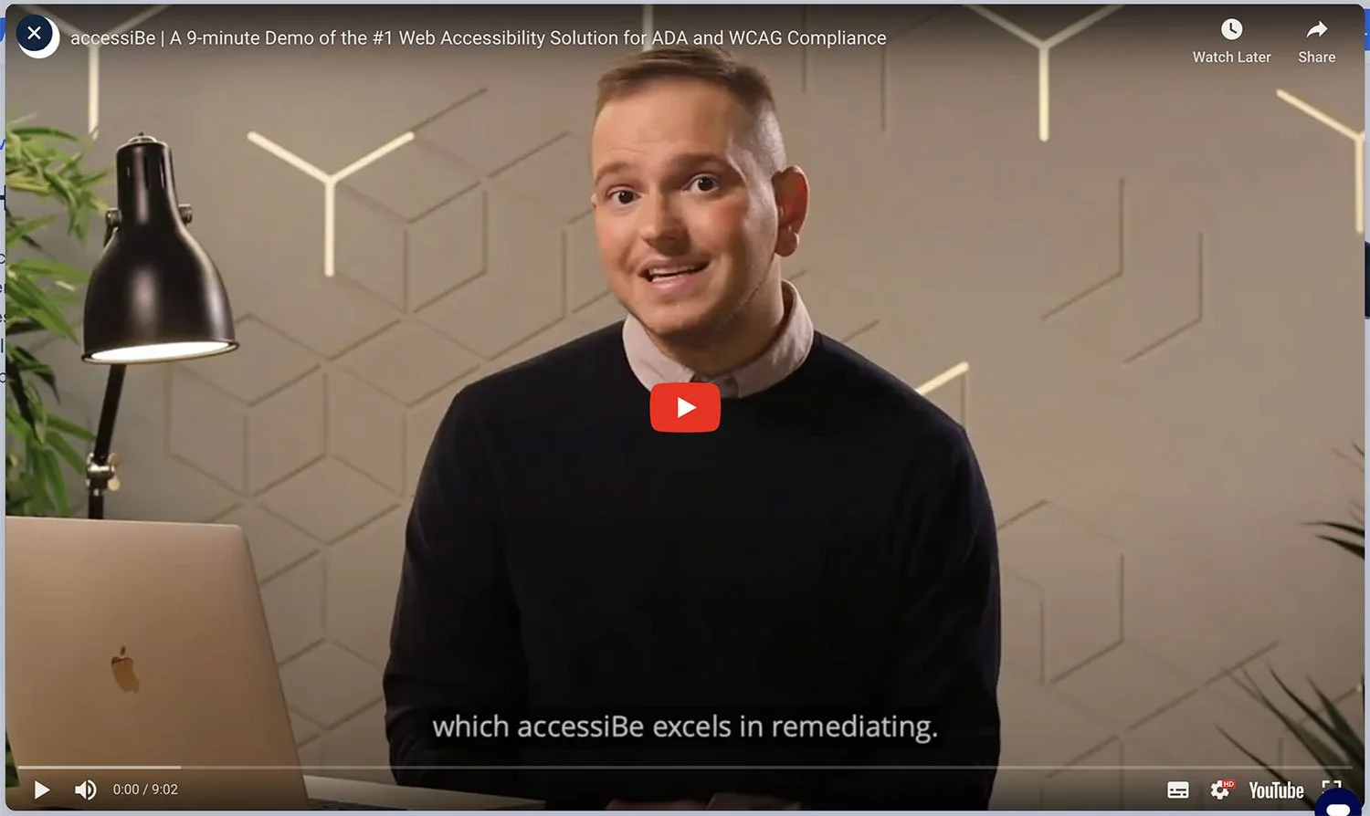
Don’t take my word for it; head over to accessiBe’s website to find out more and watch one of the two demo videos available that suit your attention span. In all seriousness, do try out the FREE 7-day trial to see how simple it is to bring accessibility compliance to your website.
This review was written in association with accessiBe
